5 Things We Hate About the New Instagram Logo

Published:

Instagram has just updated their look, complete with a fresh, new logo design, and believe it or not, most people seem to dislike it! Critiques that the logo is overly simplistic, uninspired, cheap, lazy, and hastily thrown together are being published all over the web, so we thought we would have our say as well! Check out our 5 Things We Hate About the New Instagram Logo to find out more!

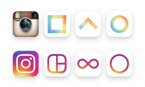
1) They took a beautiful and iconic logo and turned it into simplistic mess.

New vs. Old Instagram Logos

2) It appears that it was created by a small child while learning how to use a computer for the first time.

Funny Instagram Logo gif

3) It took approximately 10 minutes of playing with Word Art to design it.

New instagram logo designed with Word Art

4) While their old logo used to stand out from the crowd, their new logo is mostly forgettable, and too similar to countless other uninspired app logos.

uninspired app logos

5) “The new Instagram logo looks like a rejected starburst flavor” - Twitter. We couldn't have said it any better ourselves!

Starburst Candy

If you found this article useful please share: http://goo.gl/7Wbq0l


Search BoldList

Menu

Bookmark
Ctrl (or CMD) + D